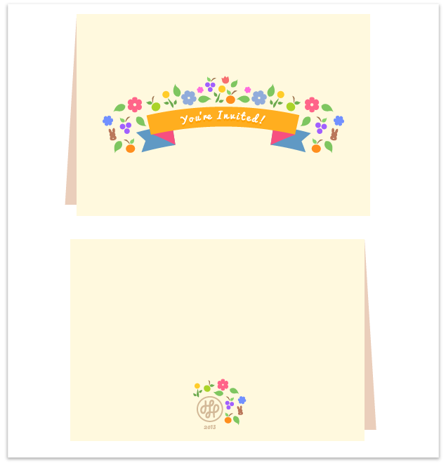
Category Archives: Design
Video

Speech Bubble Tutorial

Speech Bubble Tutorial

Having a speech bubble in your “Know how to do” library is always a good thing. This is a short tutorial to show you some tricks to creating one quick, but not dirty. You’ll end up with a clean and polished vector speech bubble that you can use for a lot of different purposes. Enjoy!

Level: Intermediate

If you have benefited from this tutorial in anyway, please feel to leave a comment! It’s always great to get to know you and also receive feedback. 

Image

Pocket App Icon

Pocket App Icon


I’ve been playing around with the new Pocket app and quite like the idea. Although the application icon was quite lacking in design. The whole 3D icon is a little over rated and I wanted to give some life to the icon. Showing the colors coming out of the “Pocket” makes it feel like there is is some life to the logo. I always feel that a product should not only look good, but also evoke some kind of feeling or emotion, even with application icons.  It’s the entire package of a brand that matters & if one thing is off, the whole product itself can seem off. This is was just a quick representation of what I see in the icon. Using more rounded corners at the bottom with sharp edges at the top. Along with flat and solid colors for the stripes.

You can check out the Dribbble shot too.

Thoughts or suggestions, what would you do differently? 

Aside

Wakfu – Game UI Inspiration & Review

Wakfu – Game UI Inspiration & Review

I am constantly playing mobile games. Its been a while since I branched out and played other games on different consoles. I’m a huge Halo fan, which is the main reason I ever owned an Xbox  360.

I started playing massively multi-player online role-playing games (also known as MMORPG’s) just to get my mind off  mobile games. Sometimes I feel that the mobile games are limiting and not as broad as they could be. So it feels good to play something that has a ton of features and is constantly expanding. I also love the feel of the social aspect and the collections/inventory features of MMOs. I mainly play MMO’s to get items into my collections –  I’m one of those players that is always fighting to get that rare item. Nerdy I know but I was started out as a casual gamer, moved into MLG (Major League Gaming) and now work at a gaming company. It’s only gotten nerdier as I’ve gotten older. I never saw myself so tightly knit to the gaming world. Now I realize that gaming is something that goes to my very core!

I wanted to share some screenshots of Wakfu and some of its very pretty UI detail. I think the aesthetics is quite nice in the game. Although the UX somewhat feels like it’s a bit clunky at times.  There are some things I wish were a little more clear, especially during the PvP stages.


The top of the login box is really quite intricate. All through the game there is this gear like aesthetic. I really like this theme and think it was quite creative. I also think they did a great job on the logo and branding of the game. It’s quite different, but memorable. The rest of the form I am not too crazy about, but do like the small details.


Choosing the land is really quite pretty too. The artwork in this game is just beautiful. Again, I really am admiring the detail surrounding the UI and the earth graphic is so pretty. That little voodoo doll is really cute too.


There are things I like and dislike about this part of the UI, which is located at the top right of the screen. The “Bug” button is quite cool — it lets players easily report bugs. It could have been placed better, however. I kept on clicking on it by accident. If I had designed this feature, I would have put the Bug button in the settings menu. I do like the colorful day and night icon. I think it displays time well, but find I the gear on the side of it to be an unneeded decoration.  The map box does what it’s made to do, but I wish I had the ability to hide it. Overall though, I think that the UI was designed very well.

Another pretty detail that I liked was the health UI details in the bottom HUD bar. Again, there is the gear incorporation with the leaves. I really think this is quite pretty and would be great inspiration for anyone creating any sort of whimsical or game interface. The HUD bar changes depending on what screen, or action the player is using.

Wakfu is truly beautiful and the character customization is quite awesome as well. The game play is quite fun, and the PvP is challenging, but it doesn’t take forever to level up. This is more of a pretty and less serious MMO. The game does offer the ability to be more serious through several premium features.

It’s always good to look at other UI for inspiration even if it isn’t in your particular field. You’ll always learn something new or see something that may catch your eye for a product in the future. So keep your eyes open, you never know what you may see that could improve yourself and your career.

What are your thoughts on looking for inspiration outside of your comfort zone?
Do you believe it’s needed to do research outside of your field?

Image

Snarphs are here!

Snarphs are here!

I am happy to announce the arrival of my new Snarph products!
These are just my proofs, but was too excited not to share. I still have some kinks and details I want to workout on the actual print. But for a first round, I believe they have turned out very well! I will be setting up a store so you’ll be able to purchase totes, pins, T-shirts and more merchandise. If you want to see more pictures, you can go to my Snarph Gallery.


So who’s interested in some cute totes?!
P.S You should follow @snarphs for updates!

Aside

Design Treats

Design Treats

  • No More Banding 
    Jeff Broderick released an awesome Photoshop action that allows you to get rid of banding on images. Be aware that it will enlarge the size of your PSD and the image you export greatly. You’ll also need to copy and merge your PSD into an 8-bit document. Doing so will retain the perfect gradient and keep the original size of your file.
  • This is How Design Works
    This is a great compilation of different types of design, their names and meaning. It’s also very eye opening to people who are not designers. It’s important that start-ups understand how critical design is to their success. Their customer’s user experience with their product goes hand in hand with what the product actually is/does.
  • Smart Dot 
    I am a nerd when it comes to cool electronics. Especially ones that go with my iPhone or iPad. Check out this laser pointer pen that also turns into a stylus. It has other features too, such as having an application for presentations.


Please comment below to share other cool links about design!